A week implementing lighting


This has been a pretty slow week as far as development goes as I've been bogged down by implementing lighting. It's been something I've been silently dreading for a while now because I'm not very good at art, and I've been worried about it's performance toll, but with a little research, I think I've found a system that I'm pleasantly happy with and am able to use across my levels.
Shout out to this article which was a veritable treasure trove of information on the subject. It was my lifeline for getting through the week so thank you kindly.
https://www.gamedeveloper.com/programming/graveyard-keeper-how-the-graphics-effe...
Art
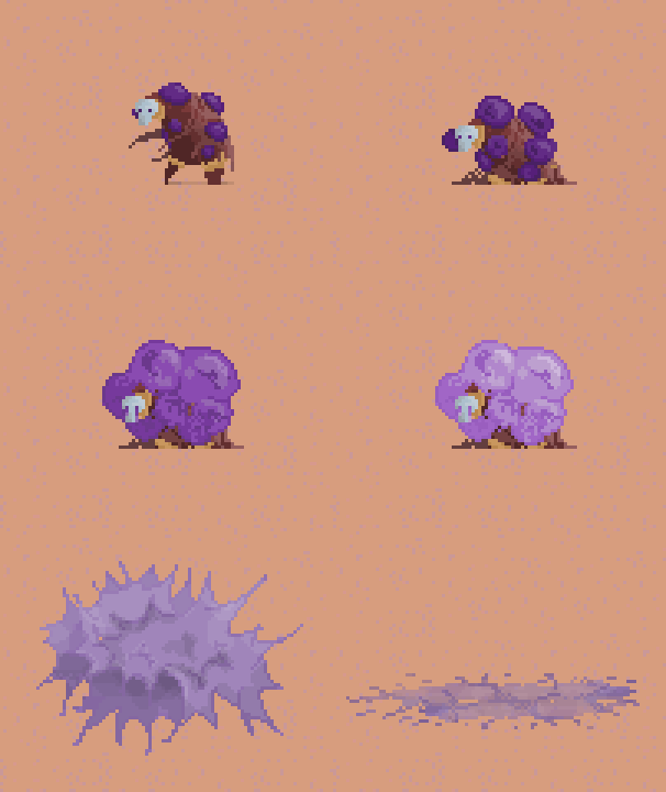
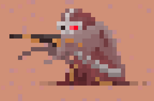
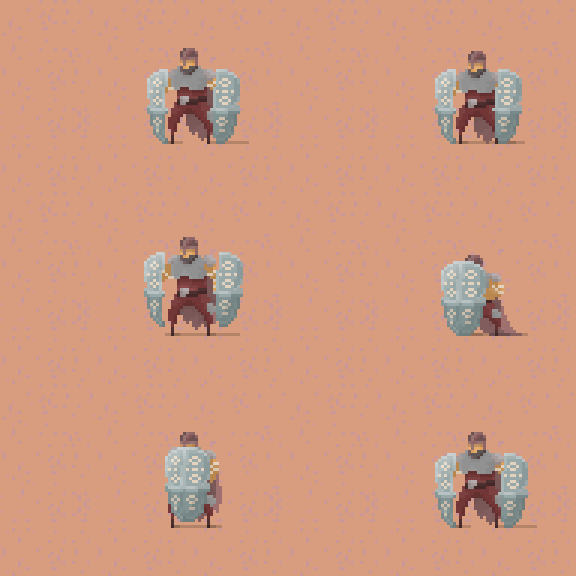
Before I jump into my stuff, I just wanted to share what Ref has been working on because that's the most fun part. Simple update, he's been creating enemies for level 2 and doing a great job of it. Here are the new enemies coming out!
(Shield carrier)

(Sniper)

(Exploder)

I love all the enemies he's making. and I think the use of purple is working out well. We've been tossing around the idea of "moon scorch" - (idea credits go to Fear and Hunger of course) in which even the normal enemies have some mutations affected by the blood moon. I expect this will be amplified to ten once we get to bosses and elites, but currently it's just the back story for the exploders and the next enemy arriving next week.
Polish, Lighting & Finishing Touches
From the start, I knew that I wanted to spend a chunk of development time polishing the visual aspects of Bloodmoon Survivors. Early on identified graphical fidelity as a key feature that would hopefully make the game stand out from other Vampire survivor clones, so on top of investing in art assets, I wanted to spend time giving it shader and lighting details to make it shine.
This week, there were a couple of things I desperately wanted to wanted to try, the largest chunk of which was lighting. It was a reach to get it working in one week, but I feel like these details are what make your game go from pretty to gorgeous, so I was determined to dedicate the time and make it good. I broke down my goals to:
- Wind effect shader
- Tree particles!
- Implementing basic night time lighting for level one
- Implement a day lighting cycle for the desert level
- Implement normal maps to add depth to static objects
In order to do this, I decided I was going to use the unity Smart Lighting 2D asset, since I've worked with it before and had pleasant experiences seeking help from the developer. I considered using the unity 2d lighting system, but I had a bit of a bias toward it because when I worked with it before, it was still experimental and I didn't like the performance impact.
Starting with the wind and tree particles I had a lot of success out of the gate. I followed a simple shader graph tutorial for the wind effects on YouTube and put together a simple particle system for the leaves to simulate them falling. The end result came out looking rather nice, and it only took me a couple of hours fidgeting with the particle system to make it look good

After that I spend time researching how to get the lighting system up and running. This took the biggest chunk of my week, but I was determined to do it right! Like I said before, the article carried me through most of the process, but I did have trouble fitting getting normal maps to work on account of using this unity asset. Some of the instructions were unclear, and it took a lot of time to make it work but it's finally in place!
I'm not ready to show it just yet because I want to polish the look of the day cycle in level 2, and work a little more on making a pleasant sprite mask for the player's glow that illuminates level 1. After that I should be good to go.
Play Testing and Other Bugs
Outside of lighting work, I've also been trying to take care of the most critical bugs that have been emerging from play tests. These are little things, but they have a huge impact on the user experience. Now that the game is being regularly put through it's paces, I've been tackling the bugs that can completely ruin a run. Here's a small list of fixes for the week:
- Fixed a bug were pressing Escape to exit the tutorial page double clicks the escape button and exits the pause menu as well. this has a cascading effect of not restoring the game timescale to 1 and keeps it permanently paused
- Worked on the tooltip which had regressed since last week. Now it is properly fitted to the screen
- User money collected during a run was not being saved and stored
- Enemy Outlines were defaulting to autoenabled and disabling them would not persist, this was an issue with the toggle groups logic not playing nice with a change I made to one of my toggle prefabs
Next week
This coming week I'm going to continue importing any art that Ref creates and hopefully we are going to work on completing a full demo vertical slice! This means no more new levels and enemies. Instead we're going to turn our attention to the elites and bosses which we have 3 of per level 12 total in just the demo (woah!) as well as polishing the VFX, gameplay HUD, and icon artwork for all the powerups.
On a technical side, I think I'm going to start reworking either the tutorial onboarding process or the questing system to better drip feed unlocks to players and keep them engaged.
Files
Get Bloodmoon Survivors
Bloodmoon Survivors
Survive the night by fighting your way through hordes of enemies
| Status | Prototype |
| Author | TheNevel |
| Genre | Action |
| Tags | 2D, bullet-heaven, Bullet Hell, Loot, Pixel Art, Roguelike, Roguelite, Singleplayer, Survivor-like, vampire-survivors |
| Languages | English |
| Accessibility | Configurable controls |
More posts
- Playtesting Continues22 hours ago
- Playtesting My Own Game7 days ago
- Polish Polish Polish13 days ago
- Art Complete!23 days ago
- Enemy Boss Balancing28 days ago
- Clean Up And Polish Week36 days ago
- Final Boss and Minor Patches!44 days ago
- Slow Week50 days ago
- Looking Towards Public Playtest58 days ago
- Finishing Localization64 days ago

Leave a comment
Log in with itch.io to leave a comment.