New UI Palette, redesigning tilemaps, and a new level!


Another week has passed and with it I'm happy to announce we've begun work on some exciting new content! This week has been a little bit of clean up, and a lot of work on the art and level design. It's been a hectic week for things unrelated to game development, but I still managed to find some time to make more content and update some of my older assets.
Play testers!
Starting with the most exciting news, I had my first round of play testers with the new graphical and UI facelift! I've had many people play the game, but this week was the first time I showcased the game with finalized art. Prior to this, playtesters were stuck with the boring developer prototype art and assets which really made it hard to invest in the game (sorry friends for forcing you to play it haha) . The feedback on the new artwork ref has been producing and the UI rework has been IMMENSELY positive (so much so that I'm a little jealous I couldn't get such good feedback with the mechanics I built alone!)
As good as the praise was, I did have a lot of takeaways from my newer players. The key takeaways were that the game has far more mechanics to juggle in your head than a traditional Survivors title and that I need to spend more time easing the player into the mechanics. Most of the ideas tossed around were about redoing the tutorial so it's more granular, with one tester going so far as to say I should add a fully tutorial level so players can get used to the mechanics.
Another key takeaway for me was the the upgrade system I added was a huge and very welcome metaprogression. I found some of the less experienced players dying a lot on the first level, and it was nice to see them using the gold they collected and tinkering with their upgrades to help them get further and further along. However, I found myself getting a little frustrated with how slowly they were completing objectives that hid the real rewards such as new weapons and powerups. To combat this in the future, I think I'm going to decouple those rewards from map and level progression and instead tie it to achievements such as Kill 1000 enemies for the first weapon, or play for 45 minutes. The reason for this is I want the rewards to be better paced for players that are not amazing at these types of games outright.
New Level and Artwork
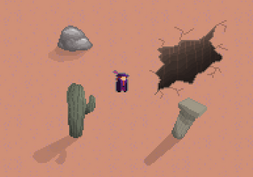
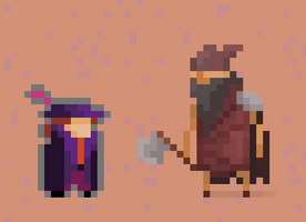
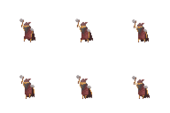
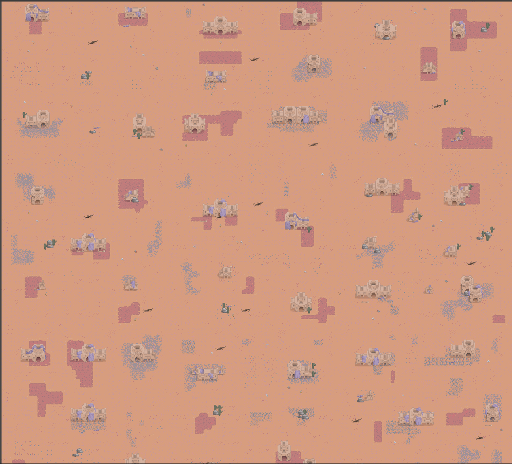
Another good thing to come out of this week is, as always, ref's new art. He's been cooking up a storm and this week he finally completed level 2 of the game's tile map along with new obstacles and chokepoints plus the first enemy, check it out!
(The very deadly and adorable marauder, they patrol the desert at dusk, looking for victims)
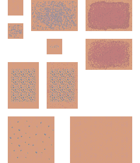
(The desert tile map which is home to the nomadic and barbarous marauders. The sands are heavy with eroded iron and lapped up blood)
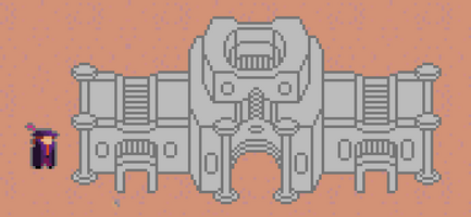
(Old ruins from ancient civilizations predating the marauders themselves. No one knows what cultures once called this place home)
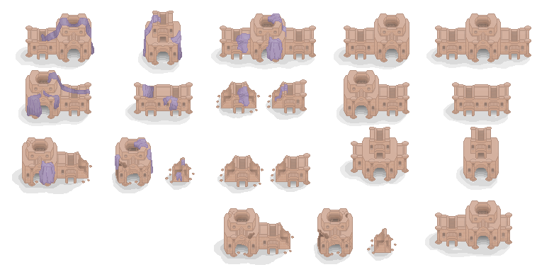
The design of the buildings is what I'm most impressed with. I fell in love the the curtains draped over the buildings which I took inspiration from in the Shadow of the Erdtree expansion. I felt they fit a desert theme very well, where everyone is trying to get away from the heat!
UI Reskin
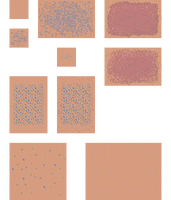
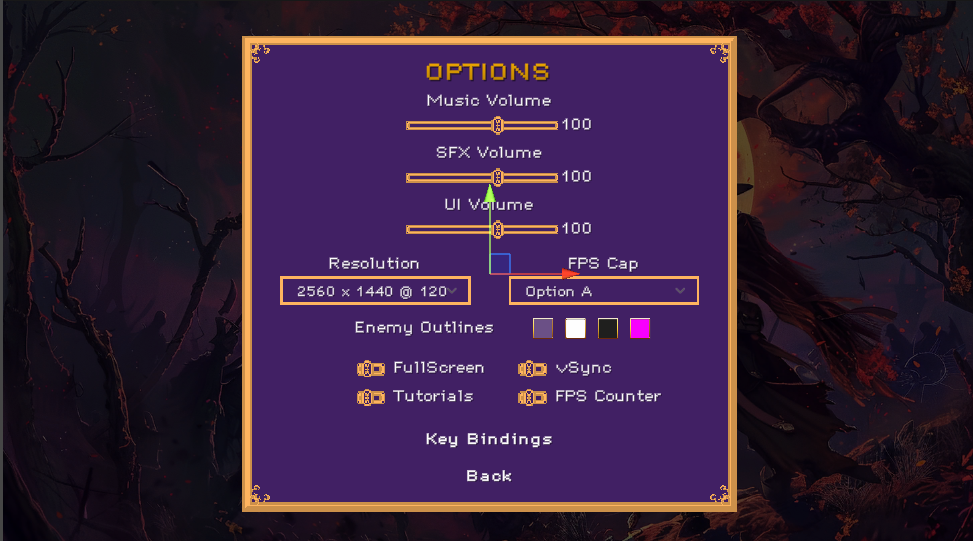
Another quick update from my end is that I followed through with the UI reskin that I promised to do last week. I've taken all of the assets I had and changed the palette to better fits the colors of the game. Check it out!
Ruletiles and designing maps for world scrolling
The last thing I worked on this week is creating a set of rule tiles and building out the world tiles for the 2 levels we now have. This was particularly tricky, but I finally cracked the code on making rule tiles that work in top down 2D. It took me a while to figure out how to get them working, but now they work without a flaw and really speed up development.
Another thing I had to do was increase the size of the world chunks for my maps. World chunks are the tiles that scroll off camera to be infront of the players where he is going. I learned from my past designs that I was making the tiles too small to add any interesting landmarks and chokepoints. I spent the week designing the second level so that it introduces the buildings and large plazas where it makes it harder for the player to dodge enemies. This is a far stretch from the first level, which focuses on giving the player as much space as possible, so that they are not overwhelmed by enemies and can focus on learning the basics.
Next Week
Need week I aim to continue updating the new level by hopefully getting all of the remaining enemies updated with new art. On top of that I want to spend some time polishing the look of my existing levels by adding a lighting system and normal maps to the tiles to give it more of a dark feel. The name of the game is Bloodmoon Survivors after all so I feel like it needs at least a little moon light and shadows :P I'm extra excited to work on the desert level because I want it to feel like dusk.
From a gameplay perspective, I think the most important next steps is redesigning the rewards system so that it isn't bound to quests. They can be a part of it, but I want my play testers to feel a more constant progression, especially at the beginning of the game where they are still dying a lot and not making much progress. The upgrade system was a good start, but I would like them to have a new weapon or powerup to play with by their third or fourth run.
Get Bloodmoon Survivors
Bloodmoon Survivors
Survive the night by fighting your way through hordes of enemies
| Status | Prototype |
| Author | TheNevel |
| Genre | Action |
| Tags | 2D, bullet-heaven, Bullet Hell, Loot, Pixel Art, Roguelike, Roguelite, Singleplayer, Survivor-like, vampire-survivors |
| Languages | English |
| Accessibility | Configurable controls |
More posts
- Progression Rebalance Update16 hours ago
- Second Streamer, New Bosses, Third Trailer, and Progression Rebalance7 days ago
- First Streamer Coverage And Tuning My Promotional Material14 days ago
- Preparing For The Next Demo Patch21 days ago
- Short Update26 days ago
- Art, Trailers, And First Official Patch34 days ago
- Game Release And First Impressions41 days ago
- Demo Released to Steam50 days ago
- Steam Verification And Major Content Progression56 days ago
- New Gameplay63 days ago
Leave a comment
Log in with itch.io to leave a comment.