More Enemies and Tackling UI Art
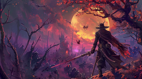
This past week has been art art and more art. As Ref continues to churn out more excellent enemy designs I've taken it upon myself to start unify the artwork for the entire game, starting with the UI. It's been a journey, and now I'm thoroughly convinced that this is the most difficult part of game design.
Enemies
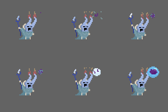
I'm excited to add two new enemies to the roster! First off, Ref has created a wonderful little spell caster that I think is tonally adorable and deadly. This character will be replacing the generic archer enemy that I have in the current build of the game, and has also come with with his very own unique VFX for the projectile he fires. I really like the design and how distinct and full of character he is.
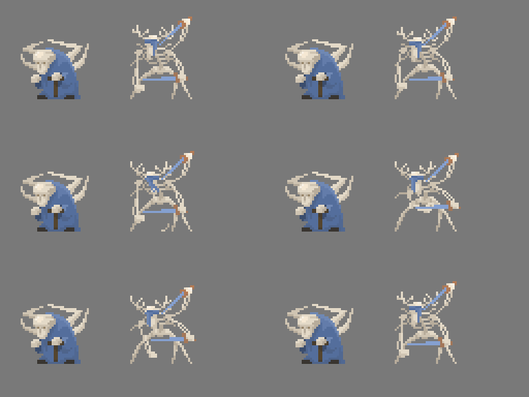
The next enemy on the list is a sort of Charging enemy that winds up and then dives at the enemy. The goal with this enemy was to accentuate the craziness of his attack pattern at make him seem just barely put together. I asked to use the Grafted Scion as a reference image for this character and this is what ref came up with! I'm a big fan of how he's coming apart and picks up his own bones. I think it adds a lot of character.
Concept Art and UI
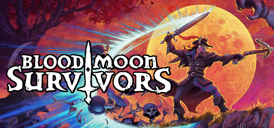
On my side of things, I've been trying to unify the UI that I currently have so that it fits the vision for the game. I've been working with Midjourney to mock up a "Mood" picture which I intend to set as the background for the main menu. Obviously, I'm definitely going to replace it with a REAL image made by a REAL artist eventually, but after a couple of hours of fiddling, I think I managed to make a main menu screen that looks good and communicates the vibe I'm trying to go for. What do you think?
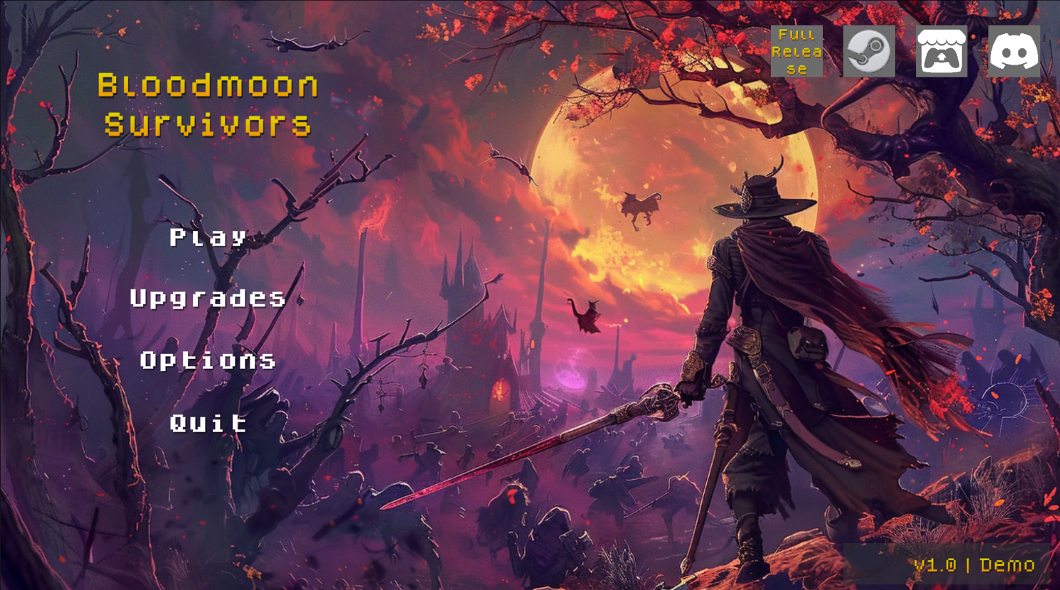
I'm a big fan of the color palette, and my goal was to recreate the first level in high detail, skeleton army and all. I think it came out rather well. My only regret is for whatever reason it refuses to draw a crossbow in the character's offhand, but that's probably a good thing since a real artist will be able to be more exact with their rendition.
My next steps are figuring out a better font to convey the game's tone and building out the other screens, which are currently a disaster. I've been slowly collaborating with another artist that's been building buttons and panels and other assets for us to use, but so far I think we'll have to pivot from what we tried because I've been struggling to make it all work together. Iteration is key
Future
That's all I have for this week. It really has just been a heads down, all art sort of week. Nothing new on the coding front. Headed forward my goals for next week is to keep nailing down the UI and have working screen shots of how it will look on all of the menus, both in the main menu and the levels. Hopefully I'll be able to get through this soon because I miss the fun parts of development and it's only been a couple of days :p
Get Bloodmoon Survivors
Bloodmoon Survivors
Survive the night by fighting your way through hordes of enemies
| Status | Prototype |
| Author | TheNevel |
| Genre | Action |
| Tags | 2D, bullet-heaven, Bullet Hell, Loot, Pixel Art, Roguelike, Roguelite, Singleplayer, Survivor-like, vampire-survivors |
| Languages | English |
| Accessibility | Configurable controls |
More posts
- Progression Rebalance Update1 day ago
- Second Streamer, New Bosses, Third Trailer, and Progression Rebalance8 days ago
- First Streamer Coverage And Tuning My Promotional Material15 days ago
- Preparing For The Next Demo Patch21 days ago
- Short Update27 days ago
- Art, Trailers, And First Official Patch35 days ago
- Game Release And First Impressions42 days ago
- Demo Released to Steam51 days ago
- Steam Verification And Major Content Progression57 days ago
- New Gameplay64 days ago
Leave a comment
Log in with itch.io to leave a comment.