Refusing the Vertical Slice and Finding an Artist!
Art Iteration
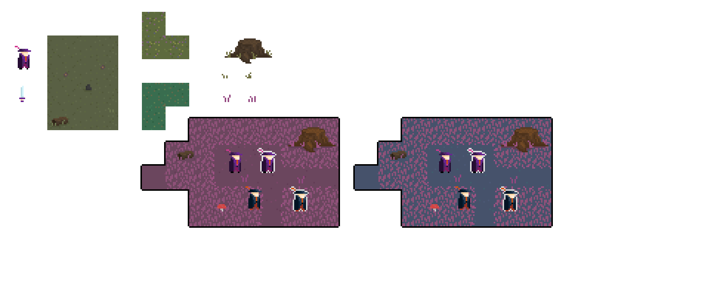
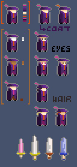
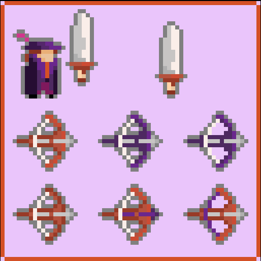
Bloodmoon Survivors is my second game and getting it to the state it's currently in has been a journey for me. While my first game, Frisbros https://thenevel.itch.io/frisbros was dev complete within a year and out the door in another, Bloodmoon Survivors has taken much longer to bootstrap. I'm finally at the phase where I've secured an artist and we're iterating on the art. What do you think?
One week of iteration art iteration:


Life Crisis And Art Assets
The biggest reason for Frisbros' speedy development cycle was that I was in a frenzy to get something out the door. I was a writer prior to starting game development, wrote 3 books, and never published a single one. When I turned to game development, took 2 years to make my first project, but it's scope got out of hand and I couldn't get it in a state where I was proud of it. Frisbros felt like my last shot to release something and my GOAL was just to get something I was happy with out the door. I cut down on scope, narrowed in on what mattered and had lots and lots of friends play test.
The other reason the game came out so quickly was because I had purchased some custom artwork and a bunch of store assets right from the get-go. It was quick and easy to iterate because I just wanted to release something, and I didn't care if the art was incredible or not. I'm not an artist, so having all of the assets ready to go was a huge spur and let me concentrate on building and playtesting the game until it was the best I could possibly make it.
I think this design approach was really good for the game. It let me take all the time I needed to cook, and to this day, I'm still proud of how Frisbros plays. It has a unique gameplay hook and the levels are built around it. However, I do wish I could give it a face lift.
Bloodmoon Rises
As of writing this, I've already spent 2 years working on Bloodmoon Survivors. It's a Vampire Survivors clone sure, but I think there are some good twists to the formula that you guys will enjoy! I've tried to build it with the same design approach of nailing down the gameplay first and foremost and I think it paid off.
The game has gone through many iterations to get here. At one point it was a:
- City builder
- Story murder mystery
- Resource gathering Survival game
I really took it through all the paces before finally trimming the fat and getting it to the state it's at. The only problem is that it's ugly as incest.
The Facelift
It took a long time to get here but last week I finally decided to hunker down and get an artist. I released the demo (as you can see) and I posted to several discords. I was worried because of my Catch 22 dilemma. My engagement was very low because the game looked bad. I didn't have a trailer, I didn't have good screenshots, it's no wonder no one clicked on it. At the same time, I needed to show the project to hook in someone with artistic merit.
It took a week of almost total silence before I got some responses. Most of the traffic came from my discord posts. A lot of the artists I were talented individuals but their portfolios didn't align with the style I knew I wanted. I had to turn a couple down, even though I was tempted to accept any offer that came my way because the responses were so low. I was almost going to call it quits and expand my search to DeviantArt or ArtStation until one artist sent me a private message with a great portfolio and told me they had prior experience working at a game studio as a pixel artist.
Current State
We've worked together for about a week, and I've been very happy with the result. I was worried because I AM NOT AN ARTIST that I wouldn't be able to communicate my vision, but we have been taking it slow and doing several drafts to find something that works. They have been very accommodating to my revision requests, and I think we set up a good system for getting feedback and failing fast.
Our process for now is:
- I give provide reference images for what I want.
- They iterate and provide a mock up
- I send out the mock up to my friends for some A/B testing and opinions (And I'll be posting this to our discord now as well if you would like to provide some opinions https://discord.gg/xZxWmcxP8K)
- We take the feedback and do another round until we're happy.
Looking Towards the Future
I will try to update our progress on a weekly basis. I'm excited with where this game is going and an really eager to share and show it off!
My next goals are:
- Replacing placeholder art with new assets
- Setting up a steam page
- Getting capsule art
- Play testing and refining the upgrade and non-demo parts of the game
Till next time!
Get Bloodmoon Survivors
Bloodmoon Survivors
Survive the night by fighting your way through hordes of enemies
| Status | Prototype |
| Author | TheNevel |
| Genre | Action |
| Tags | 2D, bullet-heaven, Bullet Hell, Loot, Pixel Art, Roguelike, Roguelite, Singleplayer, Survivor-like, vampire-survivors |
| Languages | English |
| Accessibility | Configurable controls |
More posts
- Polish Polish Polish4 days ago
- Art Complete!13 days ago
- Enemy Boss Balancing19 days ago
- Clean Up And Polish Week27 days ago
- Final Boss and Minor Patches!34 days ago
- Slow Week41 days ago
- Looking Towards Public Playtest48 days ago
- Finishing Localization55 days ago
- Influencer Outreach and Localization62 days ago
- Itch New Characters Update, Incorporating Youtuber Feedback, Reaching Out To Inf...70 days ago

Comments
Log in with itch.io to leave a comment.
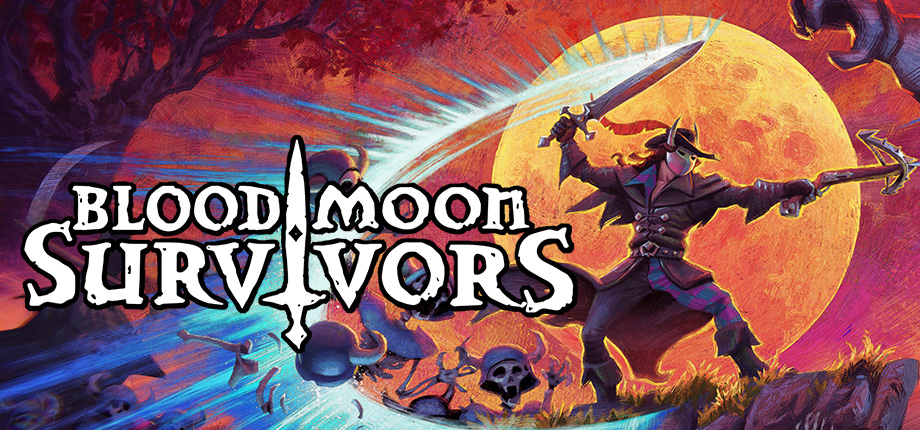
Can't wait to see more! What is the "capsule art"?
Ah, forgot to explain that! Steam requires a lot of extra pieces of art to show off your game, capsule art are a couple of different pieces that are like the main artwork for the steam page. generally you need it resized for the banner, when it's viewed in the library, and for extra events like front page and stuff